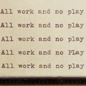
Is the text of "...Remember he's on your side" (and don't get me started on the punctuation of that line!), Is it overprinted with white ink, or is it the absence of blue ink that creates the text? If it's white ink then it may have been added in a separate pass and been slightly misaligned during a second pass through the printer (but still doesn't answer other differences).
Is the text of "...Remember he's on your side" (and don't get me started on the punctuation of that line!), Is it overprinted with white ink, or is it the absence of blue ink that creates the text? If it's white ink then it may have been added in a separate pass and been slightly misaligned during a second pass through the printer (but still doesn't answer other differences).
Its not overprinted. If you compare the cloud at the top left on both posters, you can see where that is slightly cropped on the shorter version. So, about one inch has been cropped leaving the "...Remember he's on your side" text closer to the top heading text. They are two different printings.
As Rick previously stated, fascinating. One other thing that I noticed is that the blue colour gap section between the top tip of the R inclosed triangle and the black section above is ever so slightly different in size on each of the posters.
As Rick previously stated, fascinating. One other thing that I noticed is that the blue colour gap section between the top tip of the R inclosed triangle and the black section above is ever so slightly different in size on each of the posters.
Not really, There are no other recorded examples of the Mad Max Blue Matte 26 3/4 daybill that I can find. Most of the daybills in that thread have slight differences in text or distribution details, etc eg Raiders of the Lost Ark.
Comments
Peter
One other thing that I noticed is that the blue colour gap section between the top tip of the R inclosed triangle and the black section above is ever so slightly different in size on each of the posters.
https://vintagemoviepostersforum.com/discussion/1352/slightly-different-daybill-versions-of-same-design