

Best Of
Re: Hondo's This And That
That's because no one in their right mind would admit to being the "artist"!!!HONDO said:One thing that is certain though is that we will never know for sure, along with the Godzilla Regent film poster, who were responsible for all the artwork. in question.
 John
John
Re: Beginning Discussion - Following Charlie's Path

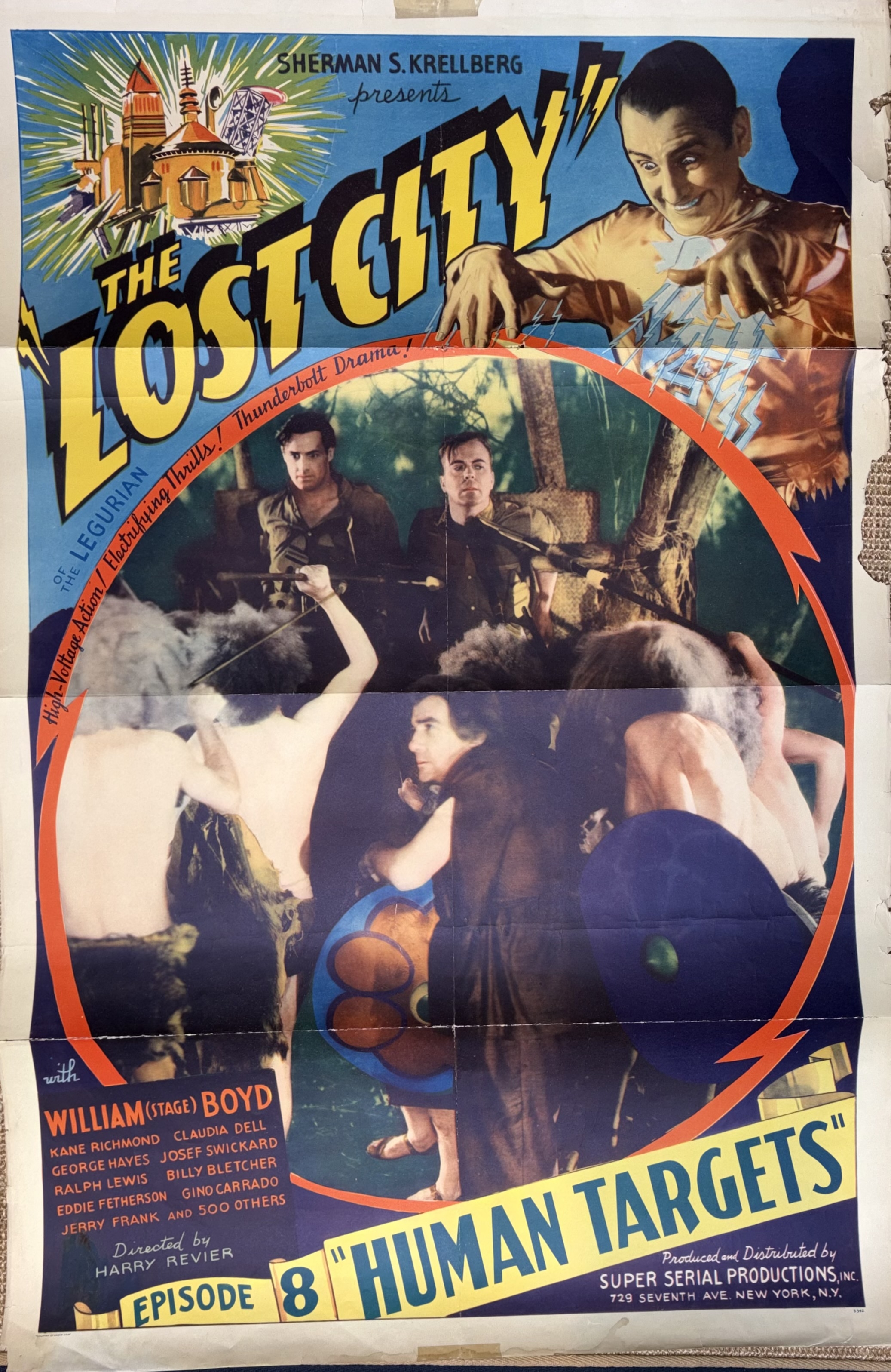

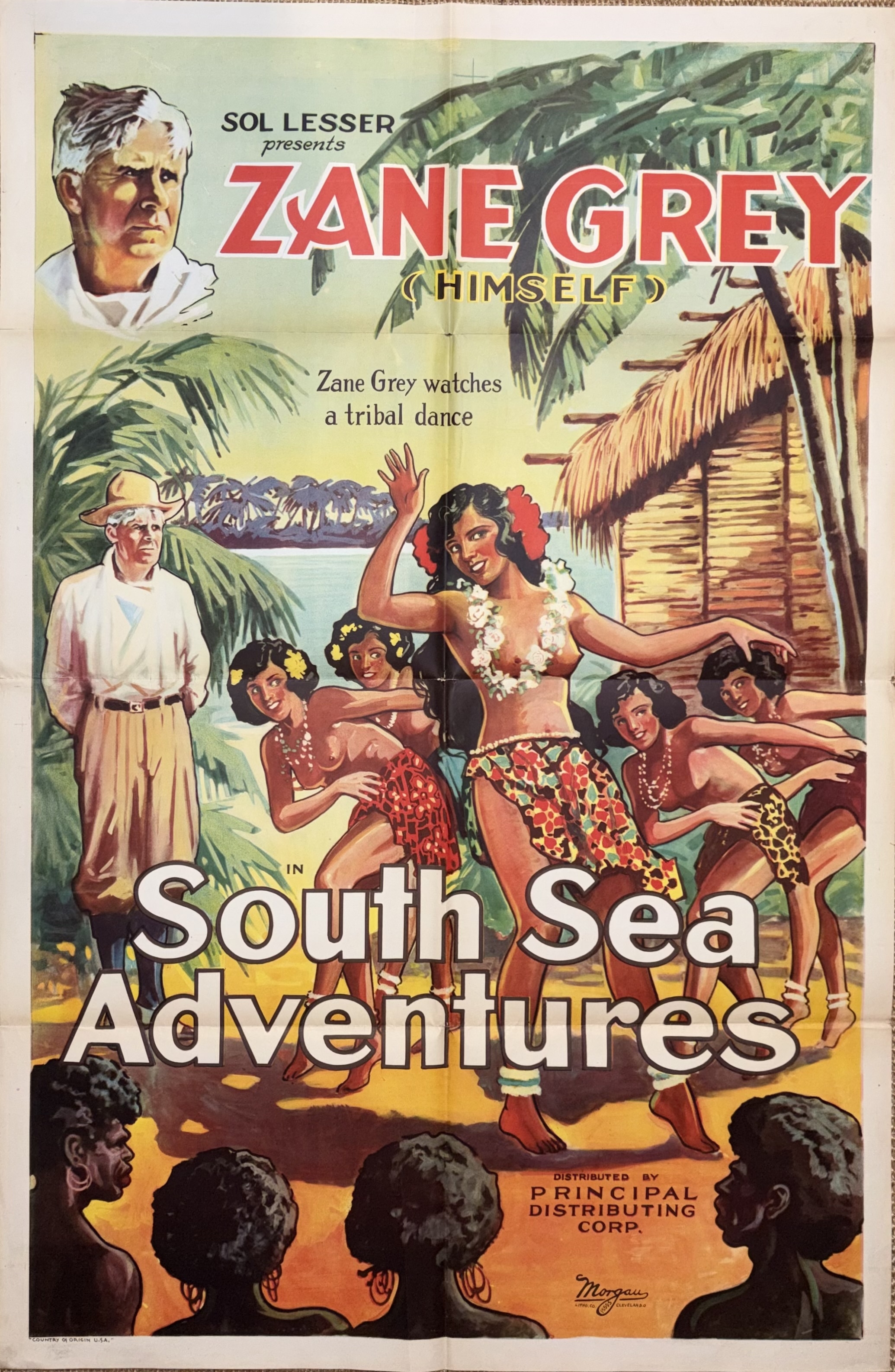
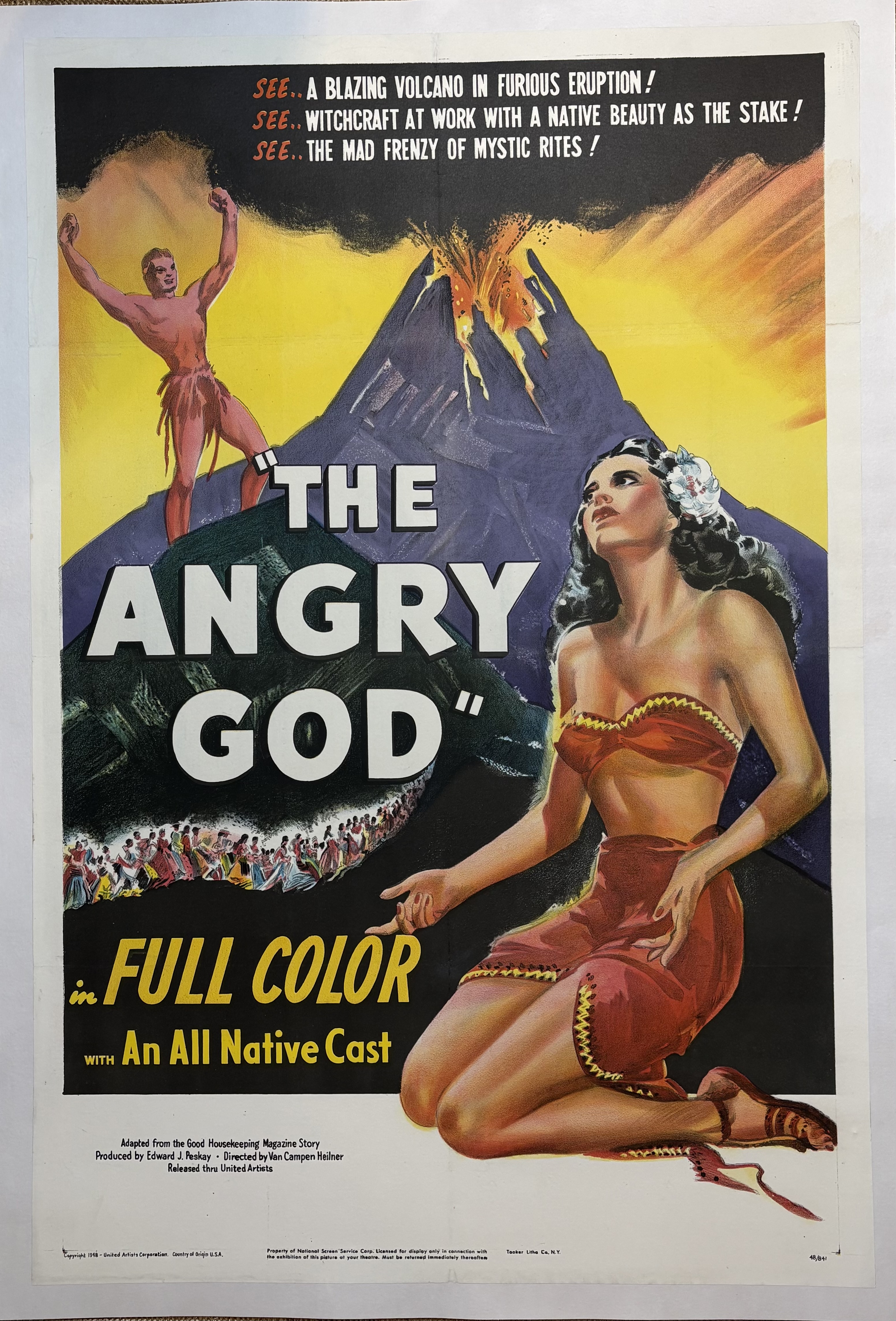 These mostly had heavy fold lines, and some tape on back.
 Duke
Duke
Re: My First Photo Setup. Only 500+ to Go
 Bruce
Bruce
Re: Hondo's This And That

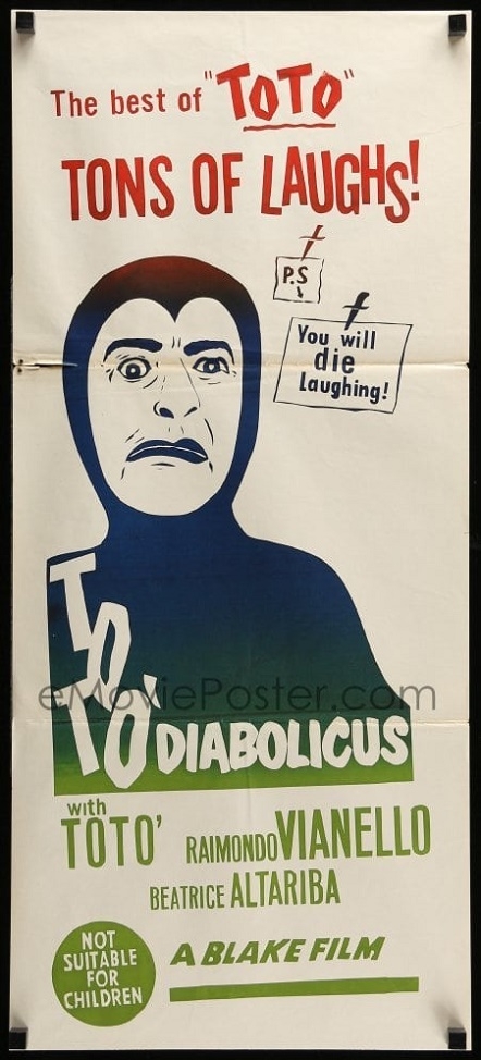
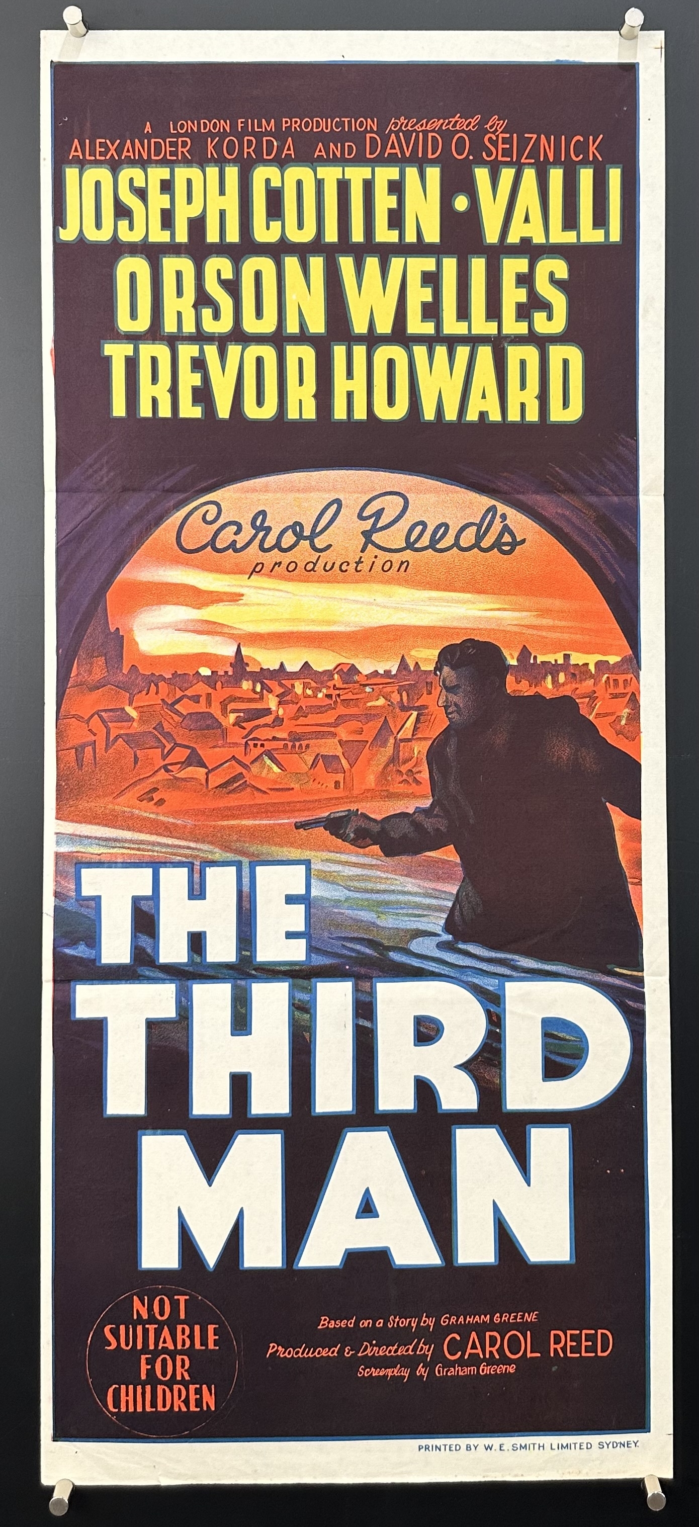
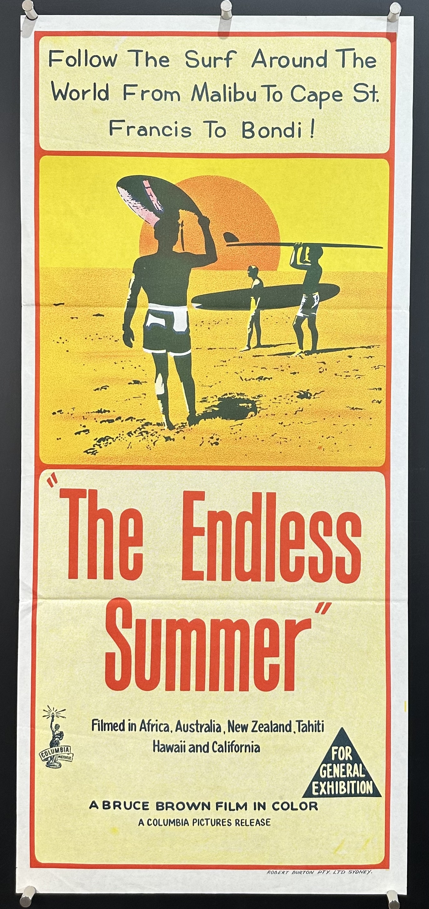
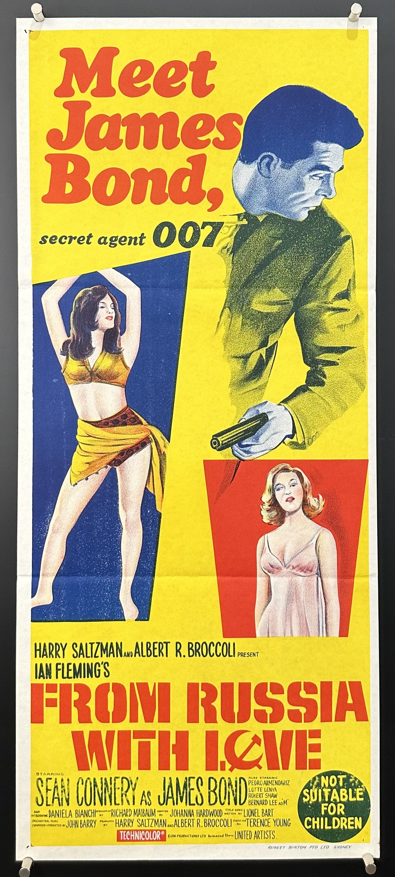
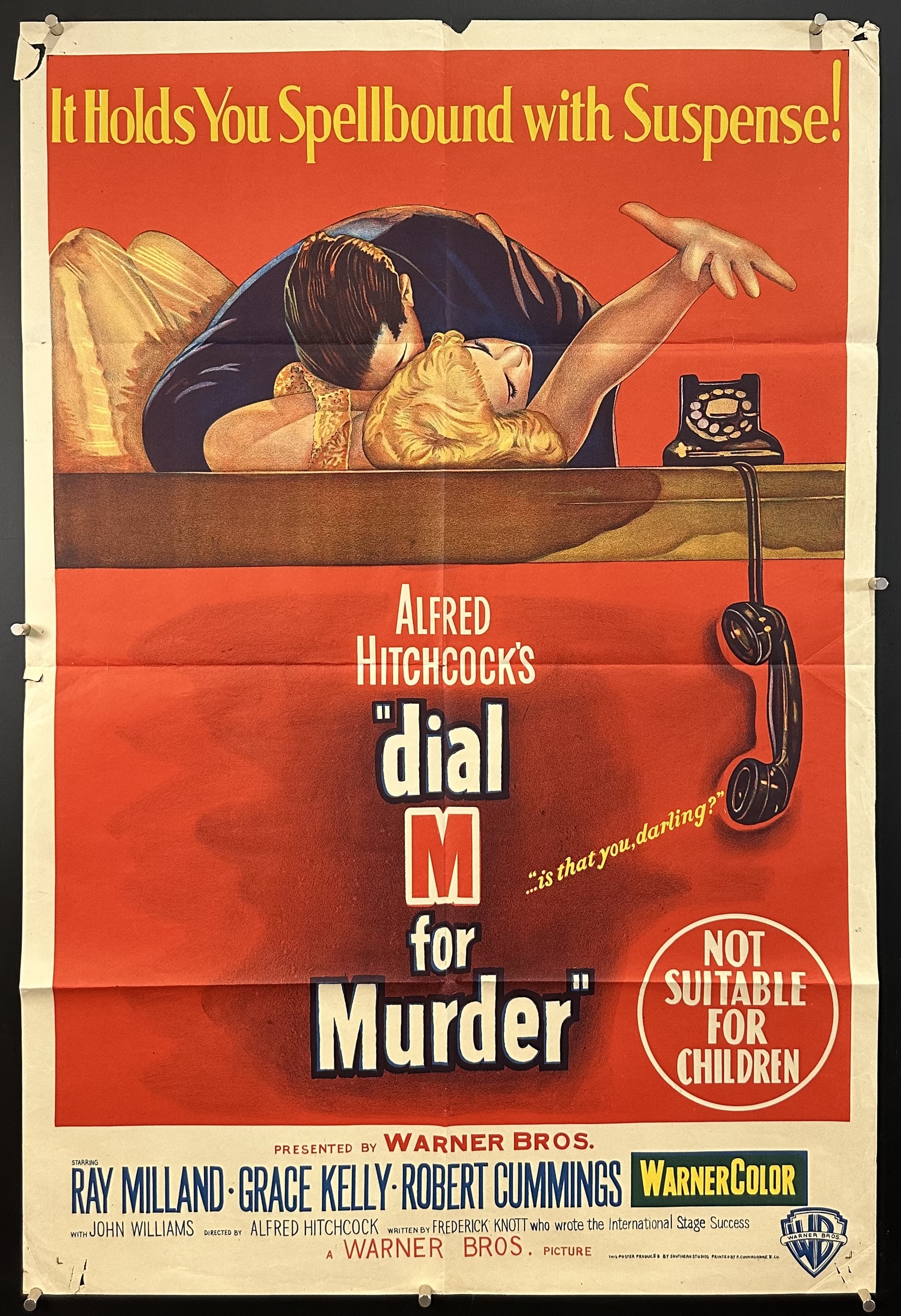
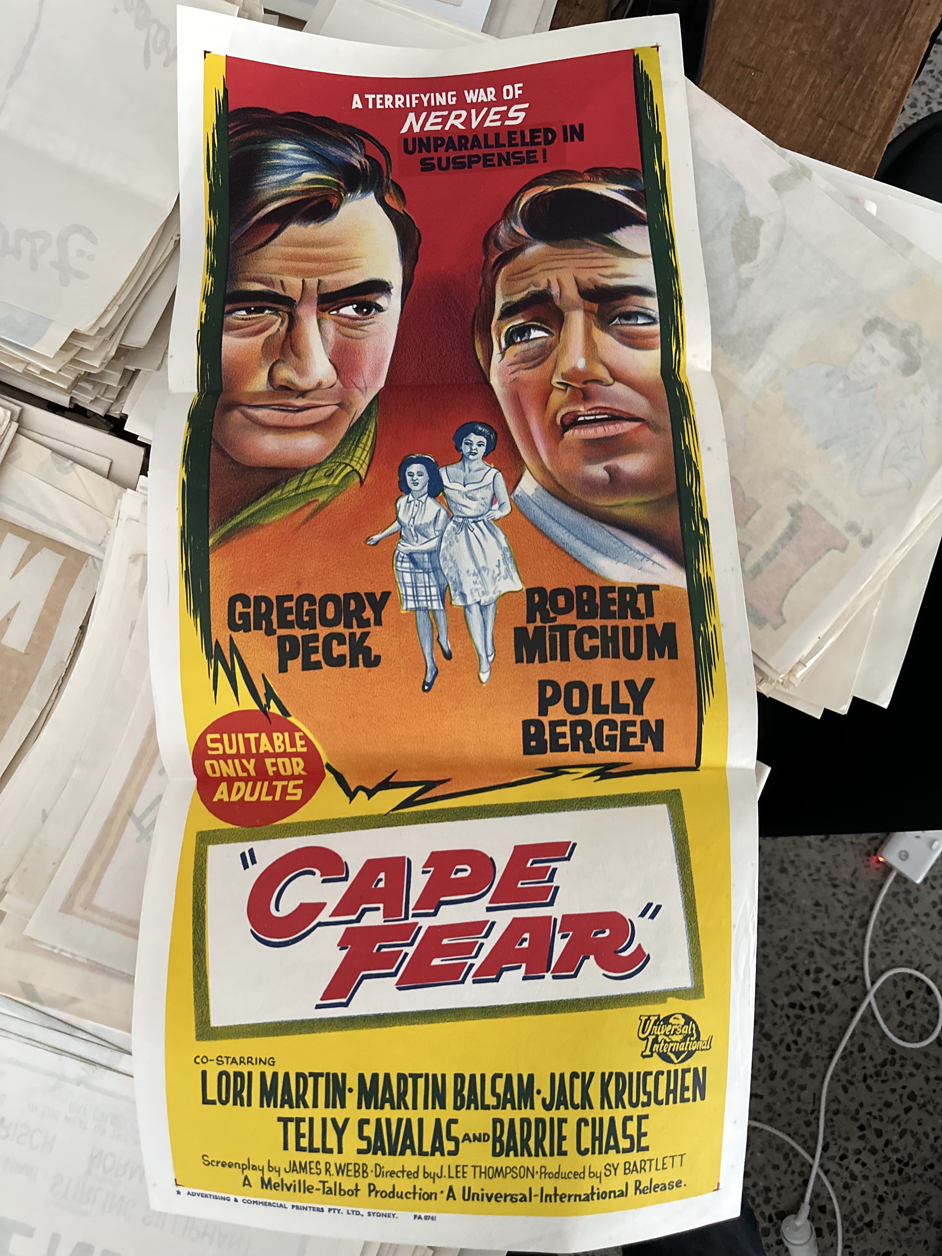
Go Johnny Go! and Diabolicus Blake Film daybill posters. How cool is the Diabolicus artwork?
 HONDO
HONDO
Re: Beginning Discussion - Following Charlie's Path
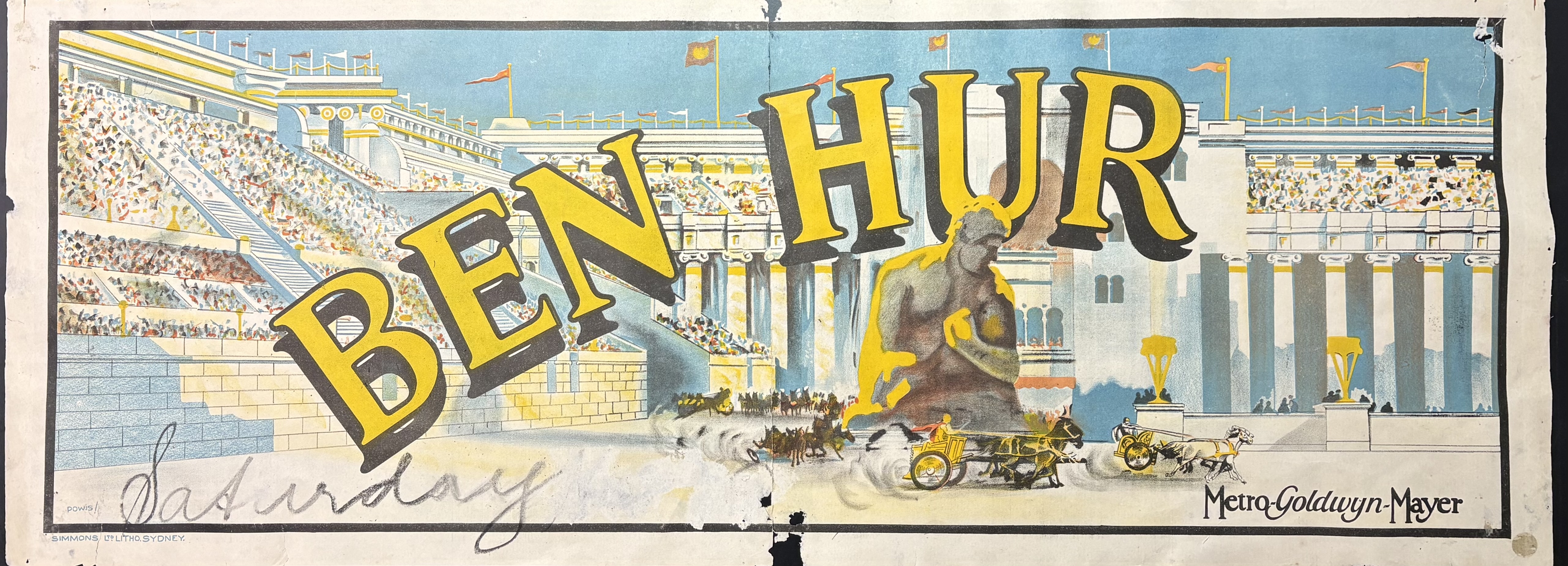
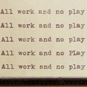
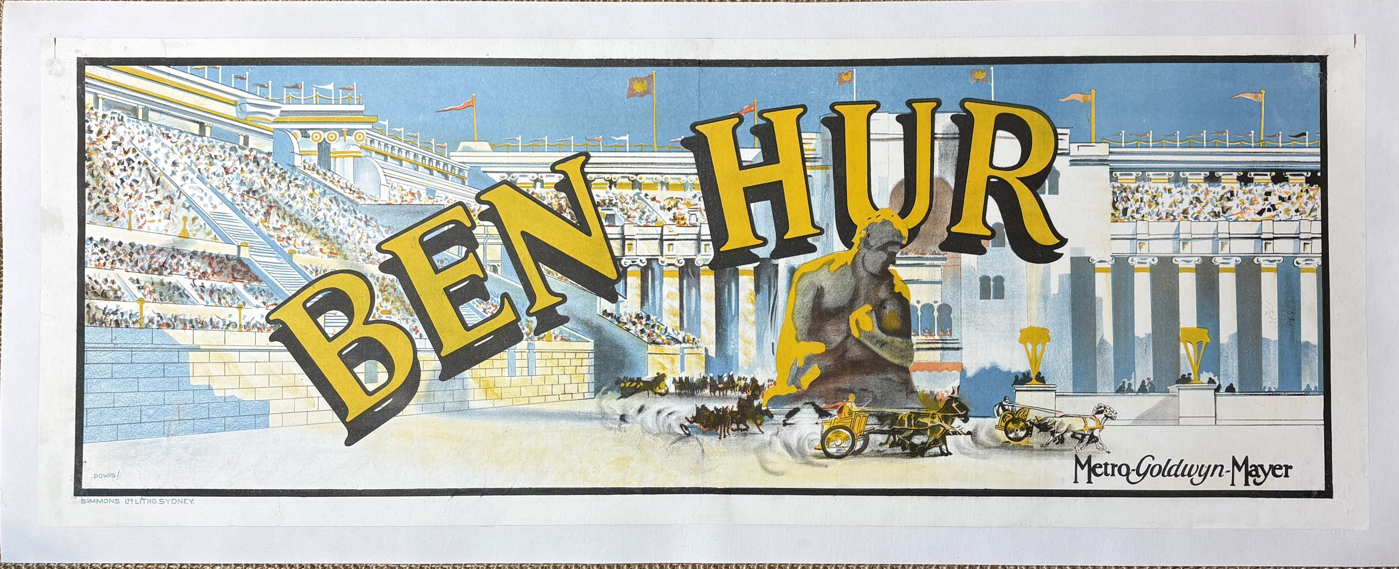 Banner that I just restored for Morris Everett.Duke
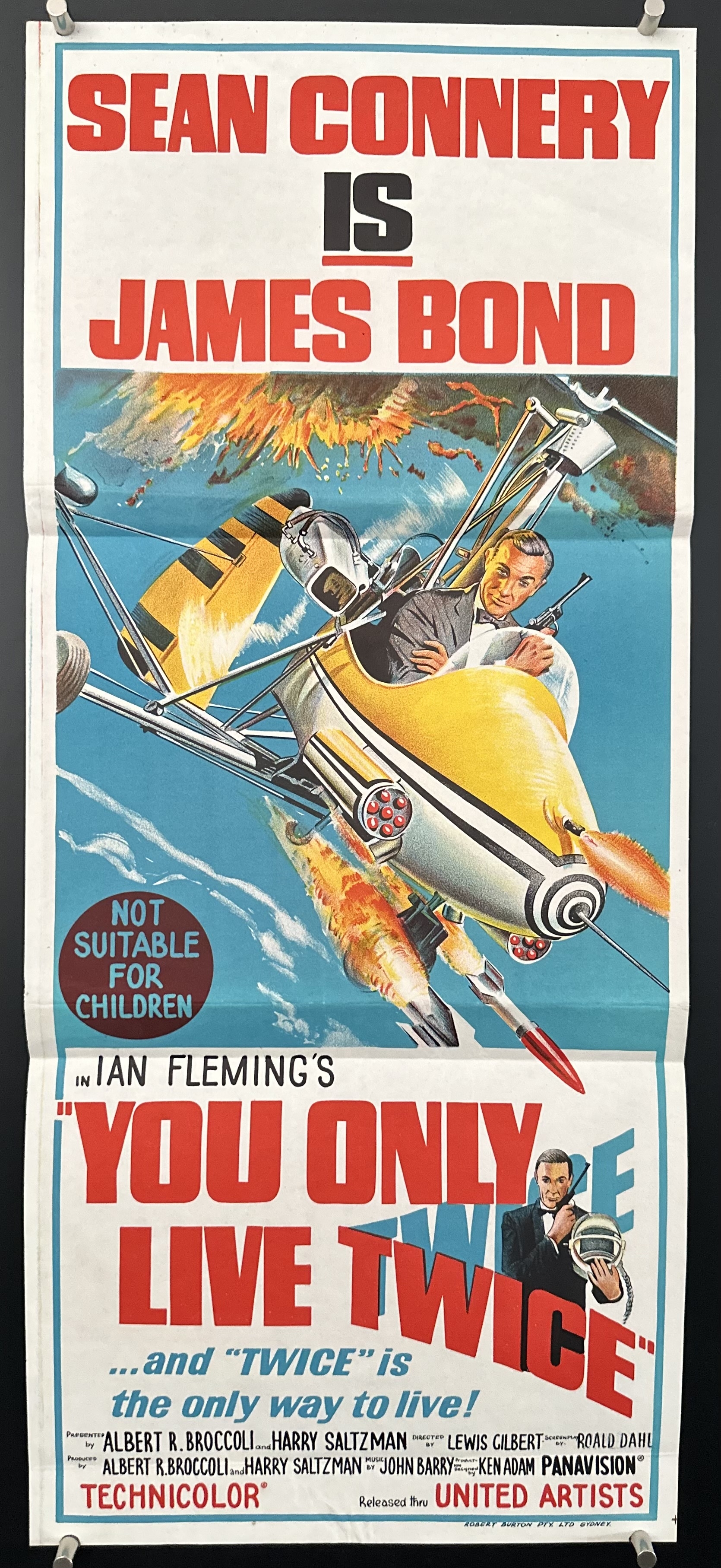
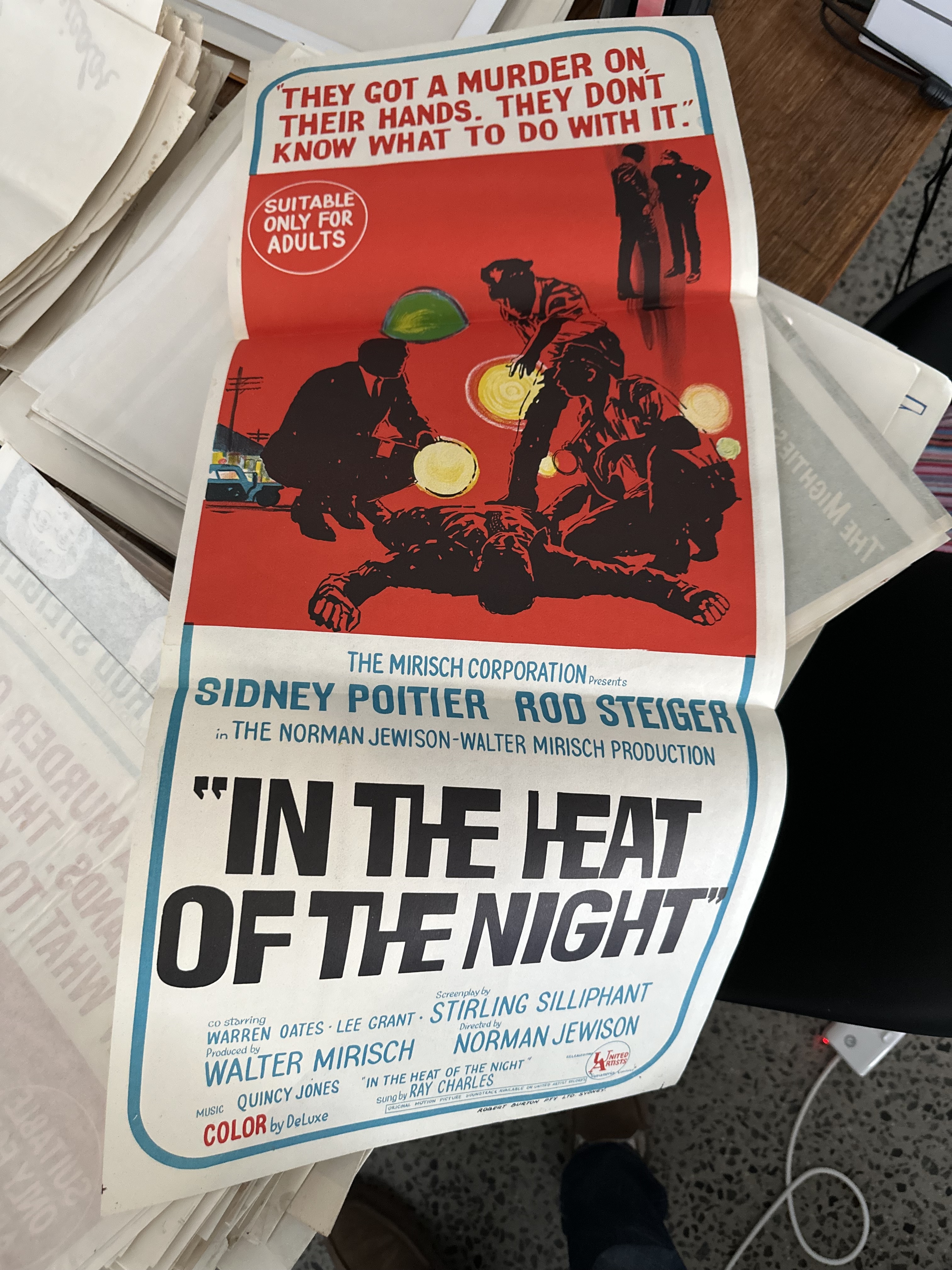
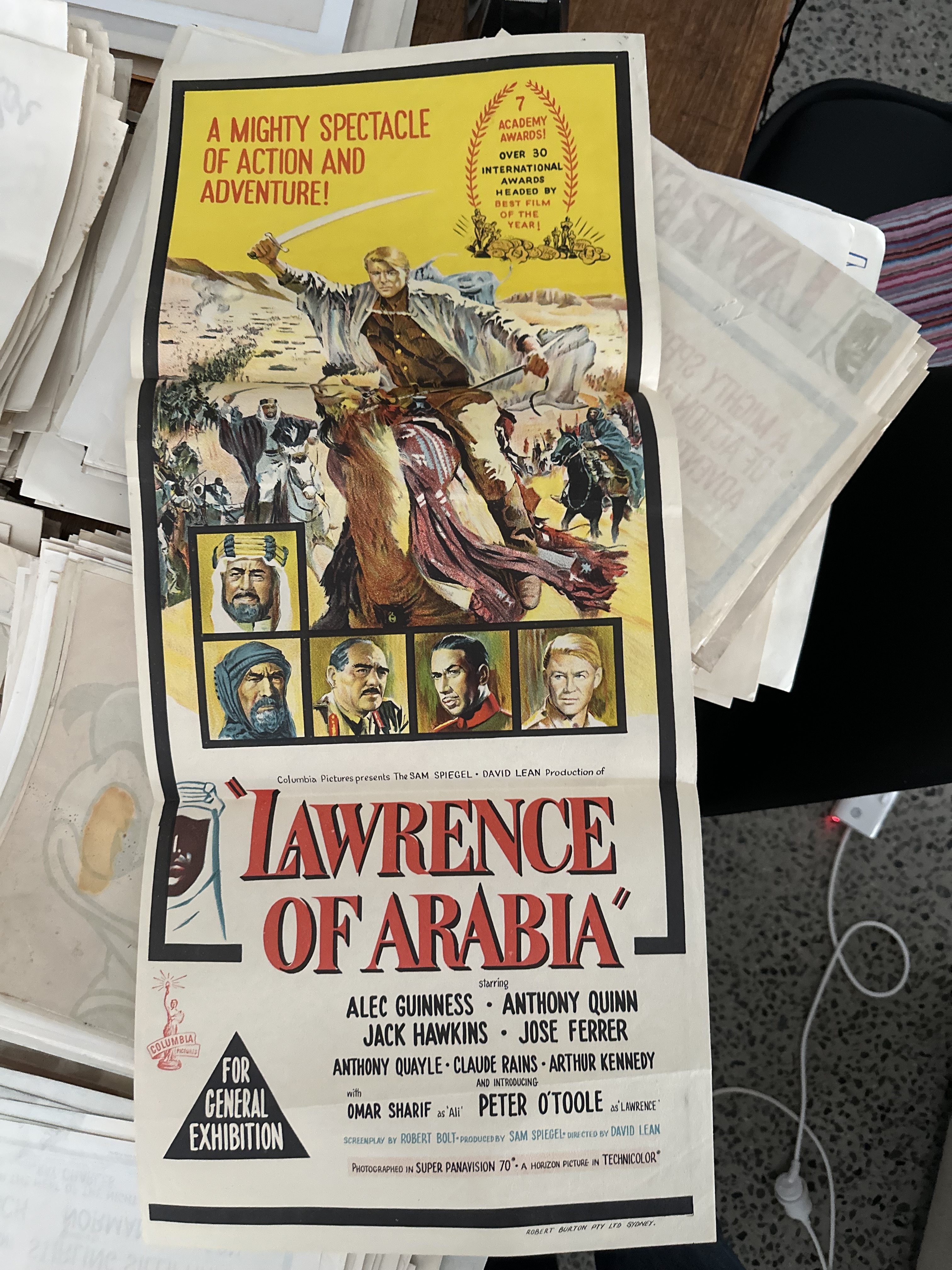
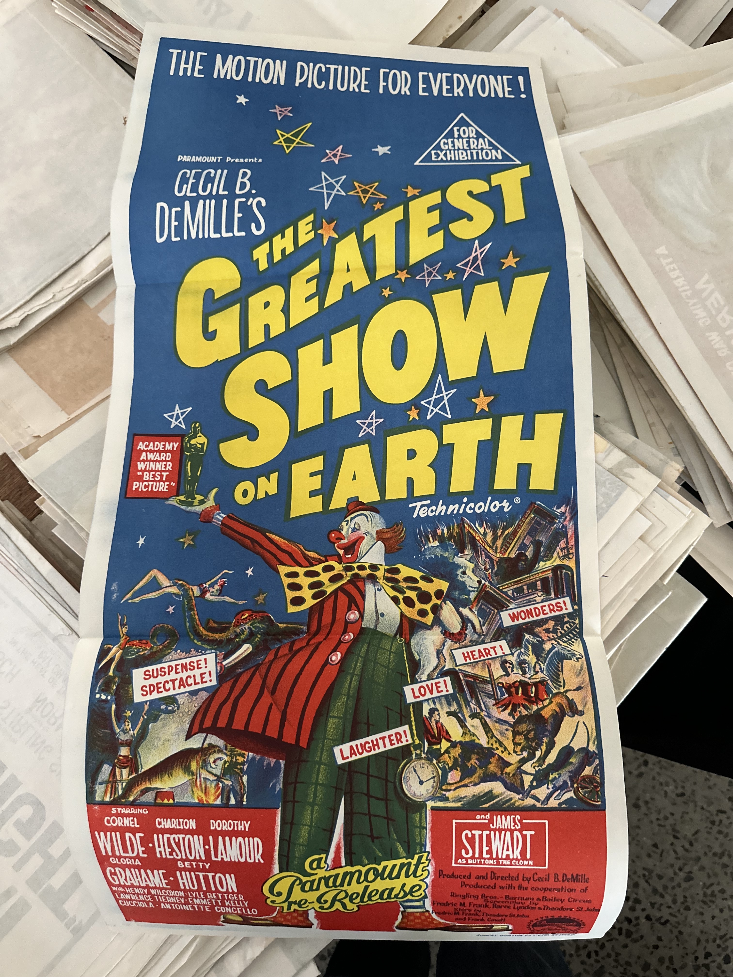


Re: My First Photo Setup. Only 500+ to Go
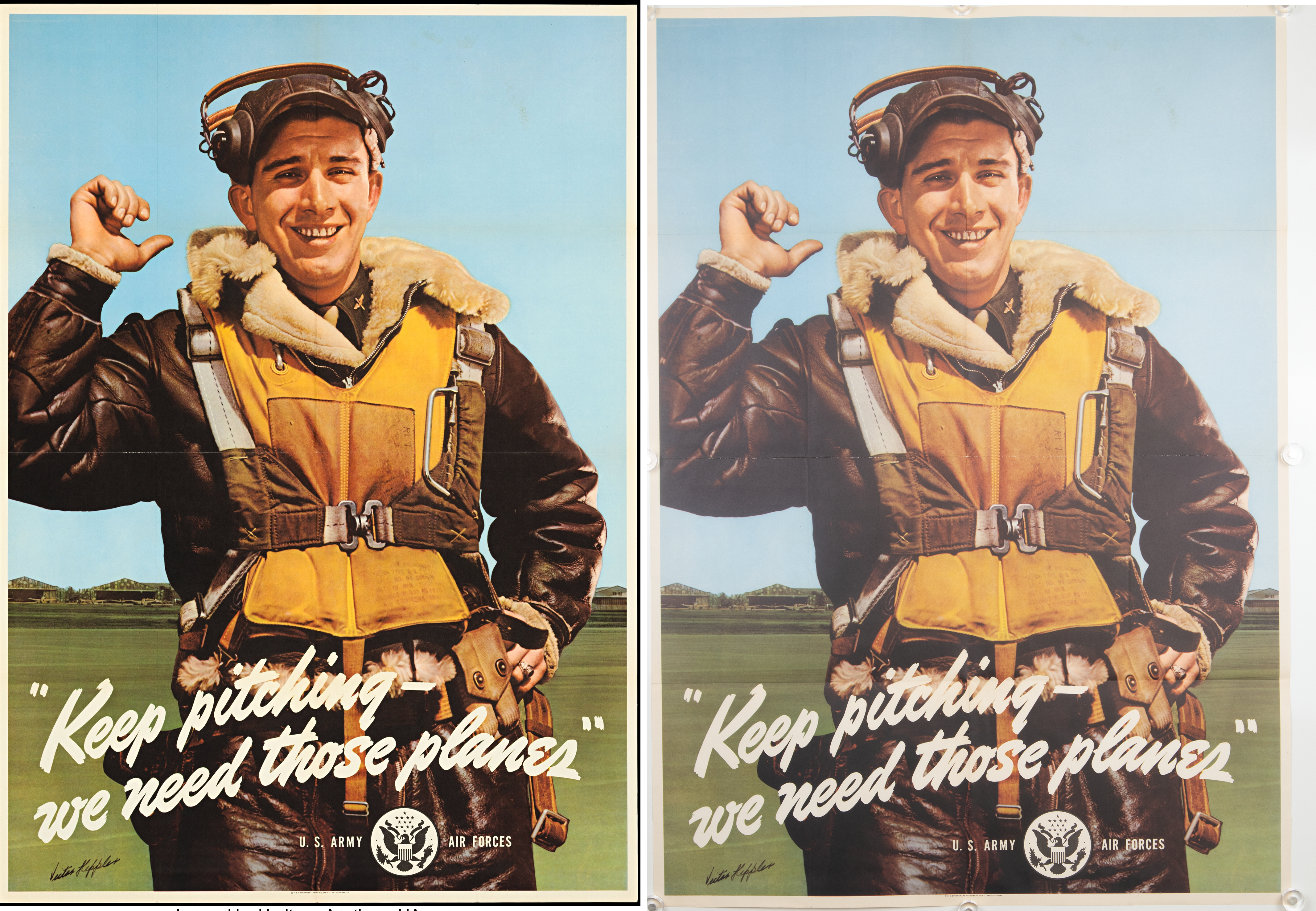
I go 180 degrees in the opposite direction. I want the image you see to look the same as what you see when you open your package. We NEVER enhance an image in any way.finepostervault said:Keeping in mind that I am truly not an expert here and that this is the first time I’ve taken this kind of photograph (so I may very well be mistaken): on the left you see the image Heritage used to sell me the poster, and on the right you see my RAW file with nothing applied except white balance correction.
The version on the left was presumably adjusted in Adobe Lightroom (or something similar). Correct?
– Higher contrast
– Deeper blacks
– More micro-contrast in the leather and the face
– More saturated blue
– Overall a “crisper,” more sales-oriented lookThat would fall under what one might call “presentation optimization.”
But is that actually what you want when you’re buying a poster?
This gives a clear choice. Those who like enhanced images can buy from the other guys. Those who don't should buy from us.
Bruce
Re: My First Photo Setup. Only 500+ to Go
Ah you said Heritage...no further discussion needed. Terrible at accurately showing you what you will get...finepostervault said:Keeping in mind that I am truly not an expert here and that this is the first time I’ve taken this kind of photograph (so I may very well be mistaken): on the left you see the image Heritage used to sell me the poster, and on the right you see my RAW file with nothing applied except white balance correction.
The version on the left was presumably adjusted in Adobe Lightroom (or something similar). Correct?
– Higher contrast
– Deeper blacks
– More micro-contrast in the leather and the face
– More saturated blue
– Overall a “crisper,” more sales-oriented lookThat would fall under what one might call “presentation optimization.”
But is that actually what you want when you’re buying a poster?

Get In Touch
